


Файл:Clarendon comparison with body text faces.png
Размер этого предпросмотра: 800 × 421 пкс. Другое разрешение: 2560 × 1348 пкс.

Исходный файл (2560 × 1348 пкс, размер файла: 233 КБ, MIME-тип: image/png)
Описание
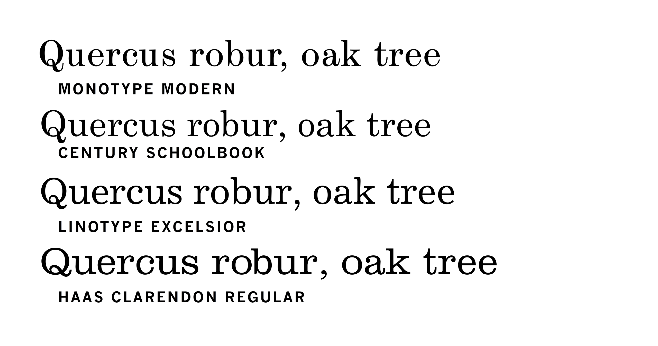
| Описание | A digitisation of Monotype Modern with three fonts inspired by this style of design. At the bottom, Haas Clarendon shows reduced contrast and a wide, display-oriented structure. The text faces Century Schoolbook and especially Linotype Excelsior have text-oriented structures with narrower letterforms and smaller serifs than the Clarendon, but they show reduced contrast and more open letterforms to increase legibility compared to the Modern, particularly visible on Excelsior’s ‘e’, ‘c’ and ‘a’. The Modern face would not have seemed so high in contrast in print at small sizes. (For specimen images of these faces in metal type, see Hutt.) Yes, I know Quercus robur should be in italics (it couldn't be as Haas Clarendon doesn't have italics)–it wasn't a great choice of sample text. |
|---|---|
| Источник | Own work |
| Время создания | 2017-05-02 |
| Автор или правообладатель | Blythwood — Лицензия: CC BY-SA 4.0 (Creative Commons Attribution-Share Alike 4.0) https://creativecommons.org/licenses/by-sa/4.0 |
| Другие версии файла | — |
Источник файла — сайт Wikimedia Commons, куда он был загружен под одной из свободных лицензий ( https://commons.wikimedia.org/wiki/File:Clarendon_comparison_with_body_text_faces.png ). Авторов, работавших над этим файлом см. в истории файла: https://commons.wikimedia.org/w/index.php?title=File:Clarendon_comparison_with_body_text_faces.png&action=history


В общем случае в статьях энциклопедии Руниверсалис файлы используются в соответствии со статьёй 1274 Гражданского кодекса Российской Федерации.
История файла
Нажмите на дату/время, чтобы увидеть версию файла от того времени.
| Дата/время | Миниатюра | Размеры | Участник | Примечание | |
|---|---|---|---|---|---|
| текущий | 15:37, 1 августа 2024 | | 2560 × 1348 (233 КБ) | Я, робот (обсуждение | вклад) | == Описание == {{Изображение | описание = A digitisation of Monotype Modern with three fonts inspired by this style of design. At the bottom, Haas Clarendon shows reduced contrast and a wide, display-oriented structure. The text faces Century Schoolbook and especially Linotype Excelsior have text-oriented structures with narrower letterforms and smaller serifs than the Clarendon, but they show reduced contrast and more open letterforms to increase legibility compared to the Modern, particula... |
Вы не можете перезаписать этот файл.
Использование файла
Следующая страница использует этот файл:
